

Dashboard
The Dashboard is the first screen the admin portal opens on. It answers three questions in one view: is the deployment healthy, what has it been doing, and what needs you to act. Every figure on it is read from a live endpoint — there are no static placeholders. The Refresh control in the header (the circular-arrow button) re-fetches all of them at once.
The whole page needs the analytics:read permission, which every tier has. One tile — the BI gaps
attention tile — reads Business Intelligence data and is Pro-only; it is called out below.
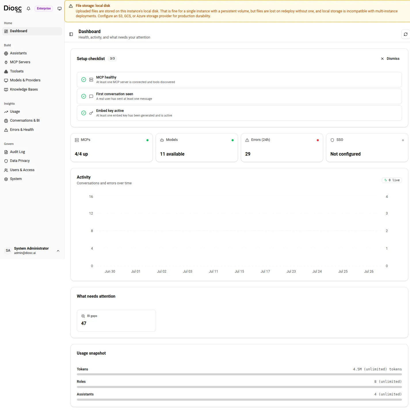
The Dashboard on a deployment carrying real traffic: the health strip and activity chart fill in as sessions run, and the attention tiles surface only what is currently outstanding.
Setup checklist
Section titled “Setup checklist”At the top sits the Setup checklist, a three-item card that tracks whether the deployment is wired up enough to serve a real conversation. Each row links to the page where you finish that step:
| Item | Complete when |
|---|---|
| MCP healthy | At least one MCP server is connected and its tools discovered. |
| First conversation seen | A real user has sent at least one message. |
| Embed key active | At least one embed key has been generated and is active. |
Each incomplete row has a Check button. For the MCP healthy row, Check does real work: the stats endpoints only read persisted health results, so pressing Check first runs a live health check against every active MCP instance, then re-fetches the checklist. Without that, the button would just re-read the same stale data and the row could never flip to done. Once all three items are complete a Dismiss button appears; the dismissal is remembered in the browser, and the checklist reappears if any item regresses.
Health strip
Section titled “Health strip”Below the checklist, a row of tiles gives the at-a-glance status of the deployment. Each tile carries a coloured dot — green for healthy, yellow for degraded, red for down, grey for unknown — and clicking a tile navigates to the page behind it.
| Tile | Shows | Status logic |
|---|---|---|
| MCPs | <healthy>/<total> up | Green when all instances are up, yellow when some are, red when none are, grey when none are configured. |
| Models | <n> available, or None configured | Green when at least one model is configured and available, grey otherwise. This is a catalog count, not a live provider probe — “not configured” is not an outage. |
| Errors (24h) | Count of errors in the last 24 hours | Green at zero, yellow above zero, red above ten. Links to the error log. |
On an Enterprise license a fourth SSO tile appears, showing whether single sign-on is configured.
Activity chart
Section titled “Activity chart”The Activity card plots conversations and errors over time for the last 30 days. Conversations
are drawn as a line against the left axis; errors are drawn as bars against the right axis, so a spike
in failures stands out against normal volume. The header carries a live badge — a green dot and a
<n> live count — showing sessions currently open right now, independent of the 30-day history below
it.
What needs attention
Section titled “What needs attention”The What needs attention card is the action queue. It renders only the items that are currently outstanding — when nothing is pending it shows “Nothing needs attention right now. All systems healthy.” The possible tiles:
- BI gaps Pro — unresolved conversation-intelligence knowledge gaps: questions users asked that the assistant could not answer well. This tile reads Business Intelligence data and requires a Pro or Enterprise license; see Licensing & tiers. On a Free license the whole attention card is replaced by a Pro upsell panel.
- Pending approvals — consensus requests waiting on a human decision. See Approval policies.
- Expiring keys — active embed keys that expire within seven days.
- Failing MCPs — MCP instances that are not currently connected. See MCP health & errors.
Each tile shows a count and links to the page where you resolve it.
Usage snapshot
Section titled “Usage snapshot”At the bottom, the Usage snapshot card shows three progress bars against your plan limits:
- Tokens — total tokens consumed in the last 30 days. There is no system-wide token cap, so this bar reports consumption without a ceiling. Token budgets are enforced elsewhere — see Rate limiting & cost controls.
- Roles — total active role configurations across all assistants.
- Assistants — assistants in use against the assistant limit for your tier. When you reach the limit the bar turns red and prompts an upgrade.
Usage is always reported in tokens, never in currency. For the full breakdown — model split, input/output ratio, per-assistant filtering — open the Usage page.
When data fails to load
Section titled “When data fails to load”If any of the underlying calls fails, a red banner appears at the top of the page: “Some dashboard data failed to load. Figures below may be incomplete or show zero — they are not necessarily real values.” It carries a Retry button that re-fetches everything.
This banner exists so a failed fetch is never mistaken for a real zero. Without it, a call that errored
would fall through to 0 in the tiles — zero assistants, zero tokens — and read as a genuine (and
alarming) value. The banner tells you the difference between “nothing happened” and “we could not find
out.”