

Theming & appearance
The DioscHub chat widget’s appearance (colors, fonts, radius, light/dark mode, the launcher label) is
configured per Assistant on the server and delivered with the widget. You author the theme once in the
admin portal; every page that embeds that Assistant picks it up. There is no theme object you pass to
diosc() on the host.
What you do control from the host is the launcher’s position and one CSS variable for stacking. Set those in your own page styles.
Position the launcher and stack it above your UI
Section titled “Position the launcher and stack it above your UI”The one style hook you set from your own page is --diosc-fab-z, the launcher’s z-index — raise it to
keep the launcher above your own overlays such as a sticky header or a cart drawer. The launcher corner
is set on the Assistant’s appearance config in the admin portal:
diosc-chat { /* Lift the launcher above a sticky header or cart drawer */ --diosc-fab-z: 1000;}The launcher corner is bottom-left or bottom-right, set on the Assistant. It is the one appearance
value that is not gated. It stays in effect regardless of licensed tier, because it’s a layout
concern, not branding.
Author the theme in the admin portal
Section titled “Author the theme in the admin portal”-
Open the Assistant in the admin portal and go to its appearance settings.
-
Set the color set, corner radius, font, shadow, and launcher corner. You set a
lightand adarkcolor set; the active one is selected by the Assistant’s theme mode. -
Save. The next time a page loads the widget for that Assistant, it serves the new theme.
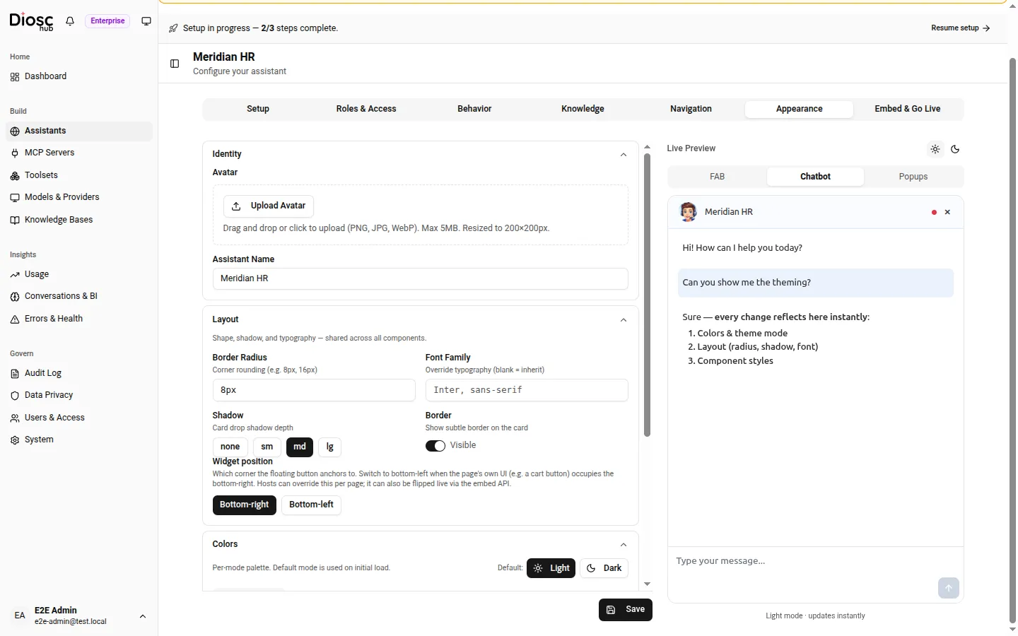
The Appearance tab. The Live Preview on the right re-renders as you change colors, radius, font, and layout — and it toggles between the FAB, the open chatbot, and popups, in light or dark mode.
Theming depends on your licensed tier
Section titled “Theming depends on your licensed tier”Custom appearance is a licensed capability. Two entitlements govern what ships:
visualTheming: your custom colors, theme mode, radius, font, shadow, and launcher label.customBranding: the Assistant’s branding watermark, and whether the server delivers your custom styles to the widget at all.
On the FREE tier both are off. A FREE Assistant renders the default DioscHub theme and shows a
non-removable Powered by DioscHub link in the widget; the custom styles aren’t even sent to the page.
On PRO and ENTERPRISE, both are on: your authored theme is delivered and applied, and the
attribution link is replaced by your own branding.
| Tier | Custom theme | Powered by DioscHub |
|---|---|---|
| FREE | Default theme only | Shown, non-removable |
| PRO | Your authored theme | Replaced by your branding |
| ENTERPRISE | Your authored theme | Replaced by your branding |
Next: position the launcher and pass page context in Widget placement.